Blog Post: Your Brand — 4 Steps to Create Your Brand with Clarity
4 Steps to Create Your Brand with Clarity
A few weeks ago I posted an article about branding — what it is and why it’s important to your business. Now we’re going to talk about creating that brand. If you haven’t read the first article, I highly recommend you jump back there and do that and work through the getting started exercises — these next steps will make a lot more sense.
With your “getting started” exercise in hand, let’s take the next steps.
Step 1: Research and analyze logos and taglines.
Which ones might fit your business and why? Which are totally not your business and why? What do you like or not like about them? How do they fit the business they represent?
Here’s a fun way to do a little research …
Clip out 10 logos you feel represent an image you think is appropriate to your business. Tape each to a piece of blank paper. You are NOT going to use ANY of these (that would be stealing, and they really won’t work for your business), but we need starting points to work from and analyze.
Research the following and note on the paper for each logo:
- Their products and services, including price range if you can figure it out
- Their market - what type of customer they sell to
- Where do they advertise - magazines, TV shows, other shops, other products you find them associated with
- What are the business’s stated mission and vision
- Are there any causes they associate with
Now, make notes on the bottom of each page:
- How do you feel about their brand being cohesive with how customers see them?
- Do you feel a kinship to them? Or do you feel like they don’t match your business style and image? (Would you feel comfortable partnering with them?)
Step 2: Define YOUR business’s image
What is the image you want to project about your business? Make this a word exercise to describe that image — write down everything that comes to mind.
Now, sketch up 5 logos you think present that image. SKETCH, don’t work out the details and worry about perfection. Describe the characteristics with arrows and notes, if you need to, for others to get your intention. Include color info if you visualize them in certain colors, note why you chose those colors. If you already have a logo, it can be one of the 5 if you still think it fits the business image you want.
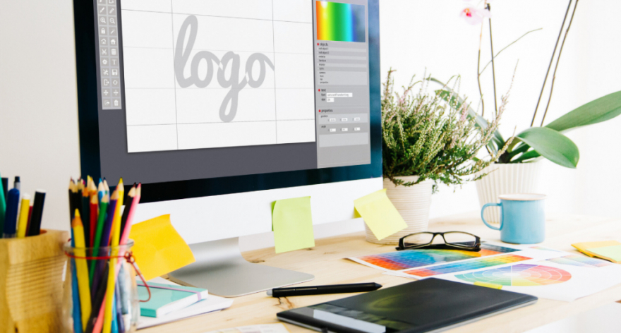
Step 3: Find a professional
Now it is probably time to get a pro involved to help you flush out the ideas for your logo and make sure they work to represent your business and products/services well. Pros can be objective and not have an emotional attachment to one choice over another. They will want to see the homework you did (see above exercises) to make sure they are providing a good assessment of your graphic sketches and advise you well. Once the basic concept is decided on, they can modify your idea to deal with the realities of use.
In researching this article, I talked with several professional branding experts (and after 30 minutes with each, I realized I was clueless about all the intricacies and details involved in branding, promotional items, printing, etc.) Having a professional help you, once you get to this point, is really invaluable to avoid spending money that will have to be re-spent later.
Denise Bromberger, owner of Image Marketing
A specialist located in Bailey, CO, Denise has been working with businesses for 20 years to build effective images. She offers a Style Guide for your brand to help you eliminate blowing your branding when using it in various applications. She says the top 5 problems that create confusion in a business’s image are:
- Having a logo that is not readily adaptable to be used at various sizes. This means your imaging ends up different on a pen than it does on a banner, or even on your website - so consistency is not there in your visual imagery. Having a Style Guide makes sure you get variations of imagery that will work for various size applications - while still maintaining a consistent brand image through quick recognition.
- Some advertising requires single-color images and often logos do not translate well to a single color. Adapting your logo imagery to a single color rendition that maintains brand identity is another critical item that a pro can do for you.
- Readability of text is critical and changes depending on usage of the imagery. If your logo is going to be on billboards, the side of a building, large signs, etc. make sure the size of text, the font choices and the background colors make the text readable from the distances that will be needed. If it will be overlaid on other images, knowing minimum sizes and appropriate background colors to keep it readable are critical (think projected presentations, computer screen or TV screen images). Choices of fonts are also critical to allow the best adaptability without having to use substitute fonts or colors.
- The basic colors of the logo and the variations that will happen due to different processes like screen printing, monogramming, multi-color printing, glazing, digitized images, etc., are critical to maintaining consistency in your branding image. Having multiple colors as part of your pallet and rules for the variations allowed helps to keep your brand consistent within the limitations of different methods of producing graphic images.
- Sometimes colors are your favorites or have meaning to you, but don’t allow the flexibility needed to keep your brand as productive as possible and communicate the right message to customers. A professional can tweak your color scheme to allow the best brand messaging on a consistent basis.
BONUS TIP! Be sure to get a complete set of format files with your logo graphics package that comes from an artist. Different processes (like monogramming, screen printing, digital copy vs printed) all require different file formats, and not having the right one can mean paying for additional graphic development. Graphics people have programs that allow them to create in the most complicated version, then translate to other versions and make the adjustments needed to maintain a great visual image in those other formats. Doing that later may require some complicated maneuvers that will cause inconsistencies and additional costs. As a rule of thumb make sure you get .eps, .png, and .jpeg files. Ask if there are additional file types you will need for virtual stationery, label printing, use with ceramic objects, screen printing, large format printing, monograms, or printed stationery, books, or magazine images.
So, how do you apply all of this to YOUR business?
After working through this research and analysis, you should know your business better and be more clear on who are your ideal clients and your target market. I don’t know the statistics, but I know a LOT of businesses spend years chasing markets that are NEVER going to do business with them. Why? They just never really thought through who wants and needs their services and who is going to actually buy from them! Some thought EVERYONE needs their services, so they have to target EVERYONE. You cannot serve EVERYONE. You cannot make everyone happy and meet their expectations. You don’t NEED to serve everyone to be successful and good at what you do. Be THE BEST at serving your ideal clients and spend your marketing time and money reaching them where they are in the marketplace. THAT is your target market!
You also have a great start on some fantastic graphic images to represent your business, with the help of a pro to decide on the one that’s perfect for you.
Finally, take a look at everything you use to market your business:
- Emails
- Letters
- Info packets
- Your website
- Packaging
- Forms and contracts
- Newsletters
- Blog Posts
What image do you see of your company? Consider the graphics, the language, the tone of writing, the frequency, the topic matter. Are you having a relationship with your clients and potential clients? Or just an information exchange? Are you creating the vision of an experience if they choose to work with you?
- Pass these ideas on to your graphic designer as they are working on your branding.
- List 10 phrases you can use to start incorporating these ideas in your language (the first 3 will probably be the worst choices — but get you thinking — so just do it badly to start your list).
- Review your letters, emails, Info packets, and website — how can you incorporate these phrases? Does other verbiage need to change to mesh with these ideas?
- Look at your office space, storefront and physical space you use for your business. Does it match the ideal space you envision to properly represent your business’s personality, vision, values? Start working on creating that IDEAL Space.
Step 4: Take Notes
Using your favorite “important notes” method, write down EVERYTHING that comes to mind daily about your business’s image, culture, language, etc. What you like and what you don’t. We’ll deal with it down the road, but you need to keep notes as you move through your days, so you don’t lose those precious observations and thoughts!
